
|
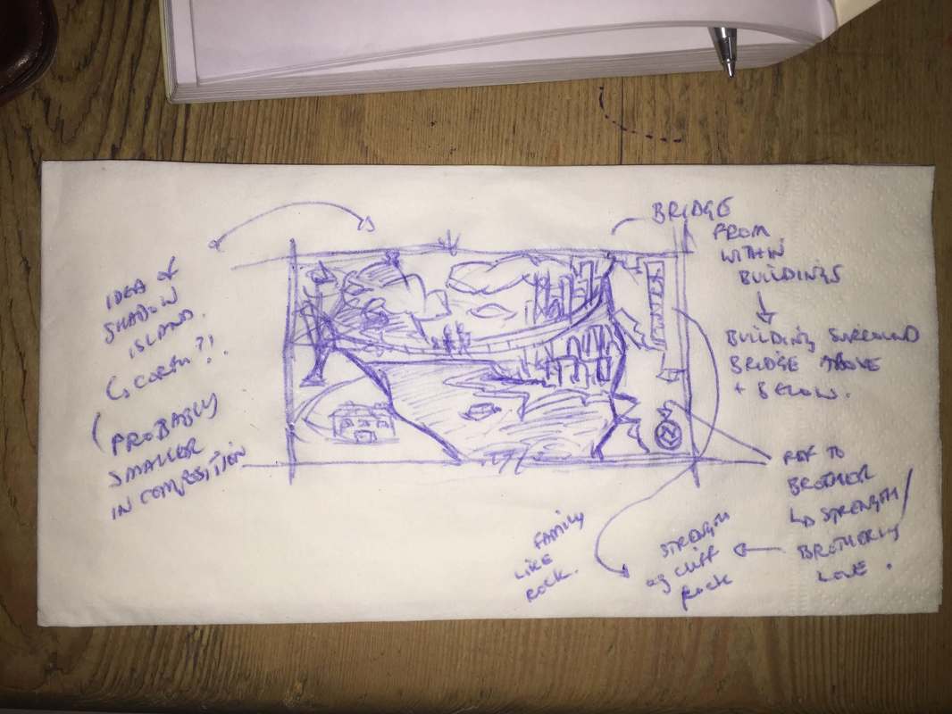
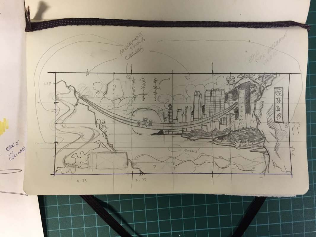
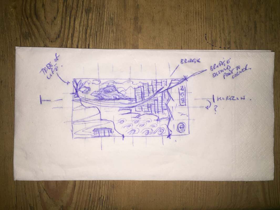
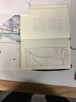
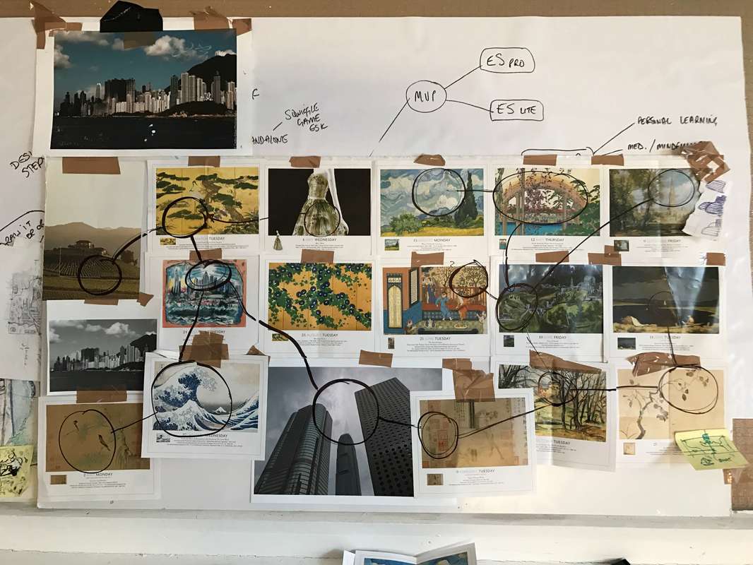
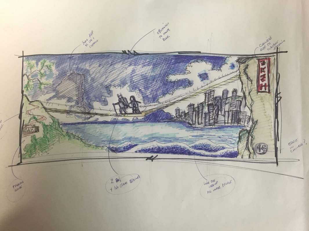
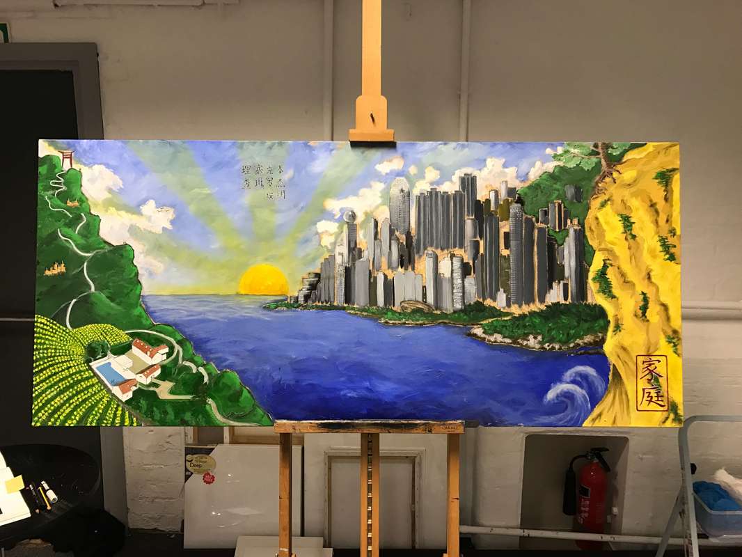
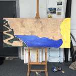
Hi Everyone, I am passionate about everything involved during the entire cre8iv process, I see 'the' artwork being from end-to-end not just the final image / canvas / illustration / video. From the initial discussions, which has my mind firing on all cylinders, generating explosions of ideas bouncing off and into each other; to merging and bonding these with other peoples comments and ideas; to the focus involved and the self discipline to turn these visions into a real concept; and, finally the elation at handing over the final deliverable. This may go against many professional artists' opinions but I have never been one to follow the crowd - you should read some of my school reports haha. The initial brainstorming stage, often overlooked & undervalued by most, is the hardest and most important part of the project. Preventing our ego's & with it our programmed responses from jumping into the conversations and undermining / derailing / judging other peoples and our own ideas is extremely tough. That's why Cre8iv Edge offer guidance through this stage, by setting Green-Housing rules which encouraging the 'SUN' [Suspend, Understand and Nurture] and reduce the RAIN [Reaction, Assumption, Insisting & Negativity] . This prevents negative words and phrases like 'yes, but', '...we have tried that before...', 'no that wouldn't work' and replaces them with 'yes, I like it and...', 'Yes, we could..', 'Can I build on that?..', 'Great idea & ...'. This fertile environment helps generate many more ideas and ultimately unique solutions. With this, gardening analogy in mind, I always like to try and put together a summary of the latest Cre8iv Edge project for the client and also as a personal record, which I hope will be of interest to the reader. As the last few months have been very busy there will be a few of these posts over the next week or so. 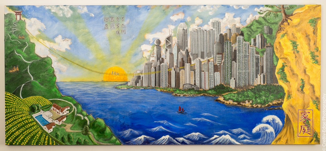 Petit à Petit [Dordogne HK] Oil Painting This project started life in Hong Kong over a few drinks on Lan Qui Fong. I was over there for 2 weeks on a work assignment and I happened to be introduced to the eventual commissioner and his wife. He explained that he had been living in HK for 15 years and his wife was originally from a village near Bergerac [no not the detective... that would have been a completely different painting] in France and they had just bought a place out there. The place was being updated and the artwork needed to reflect the new look and feel. So we began our green-housing exercise [which is much easier after a few drinks on Lan Qui Fong]. The touch-paper was lit and we were in our element [there is nothing like being in the flow], I was seeing HK angled cityscapes florescent in the night sky coupled with an influence of the Buddha across the bay, they were visioning tranquility and the meditative elements in the hills surrounding HK. I agreed to work on the initial concepts when I returned to the UK. Some of my initial sketches are shown below on .... yep napkins lol... I don't smoke so I didn't have any fag packets to nail that cliché. Before I drew the sketches below, I did some research while in HK and put together the mood board shown - top right. I realised early on that I wanted to replicate the look & feel of old Japanese and Chinese artworks, combining it with western works that use light within them to focus the viewers attention. Ideas were discussed over skype and moulded into the two blue sketches below, these in turn were turned into the coloured concept sketch before the final composition was designed in my ... sketchpad :). The design process was never static, it was organic throughout with elements from prior meetings emerging later while working on the canvas and being incorporated into the overall piece [ok... so I am back tracking a little here... I will not be telling you all the hidden messaging within the canvas... I agree with the general consensus here that this should be observed - hah].
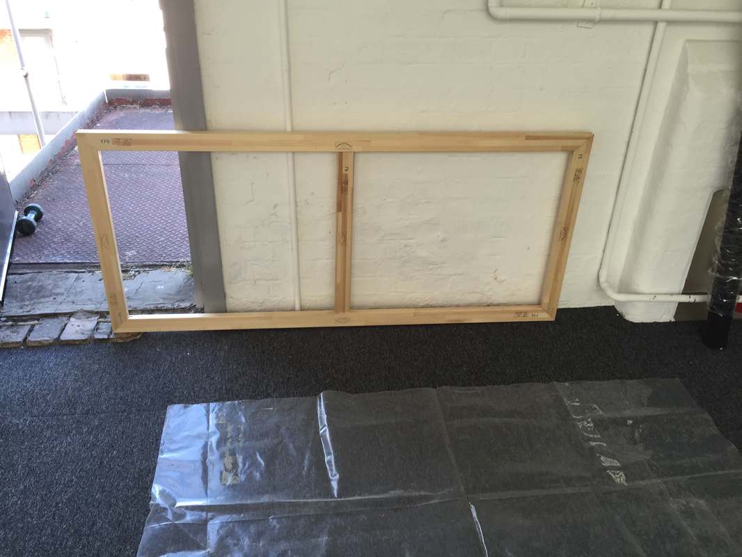
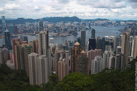
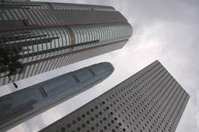
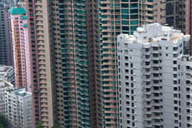
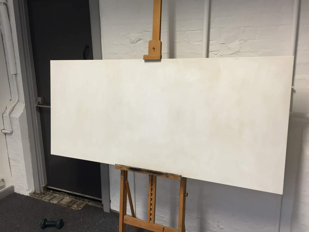
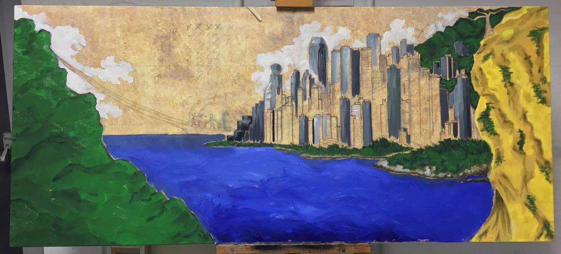
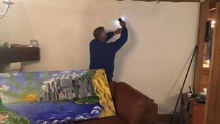
While taking a short oil painting course at Chelsea college of art, they taught me how to build and stretch my own canvas - you can see the frame above. This isn't difficult at all and I am not blowing any trumpets here. I just find it adds so much more to the artwork, building the artwork from scratch just feels complete. I've also included a few of my research photos below. I love Hong Kong and I can spend hours wandering the streets with my camera. The colours and urban textures are amazing and they definitely influenced my work on the HK side of the canvas.
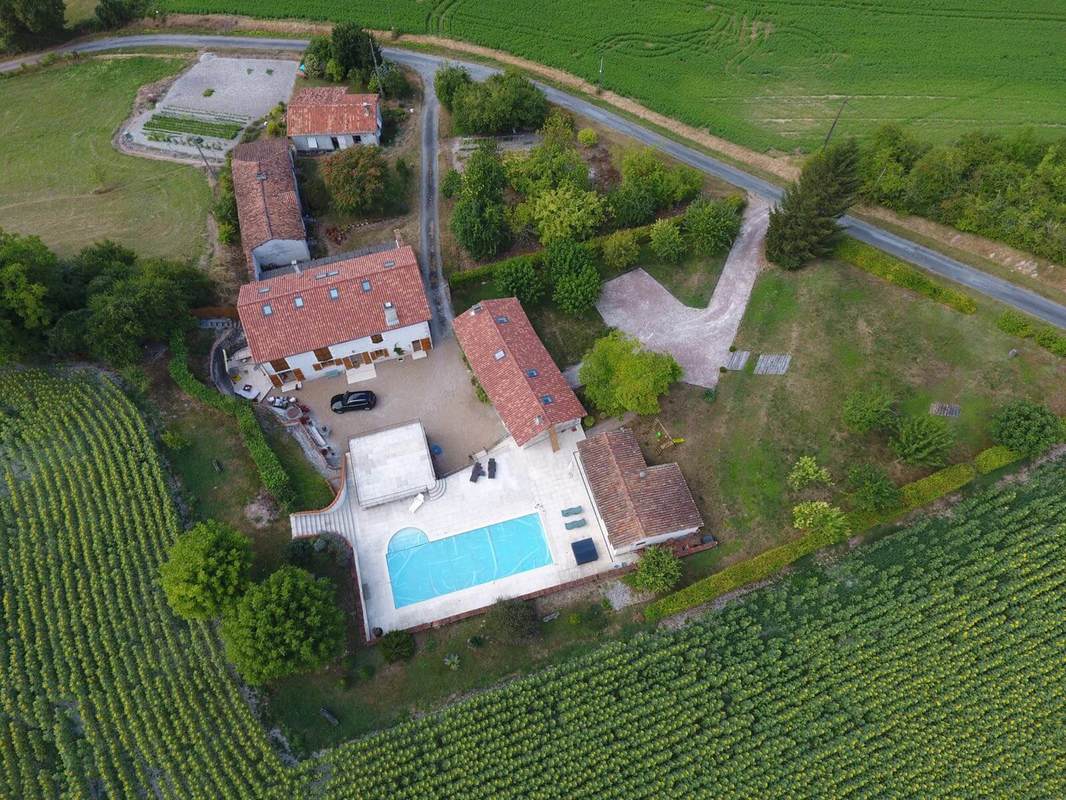
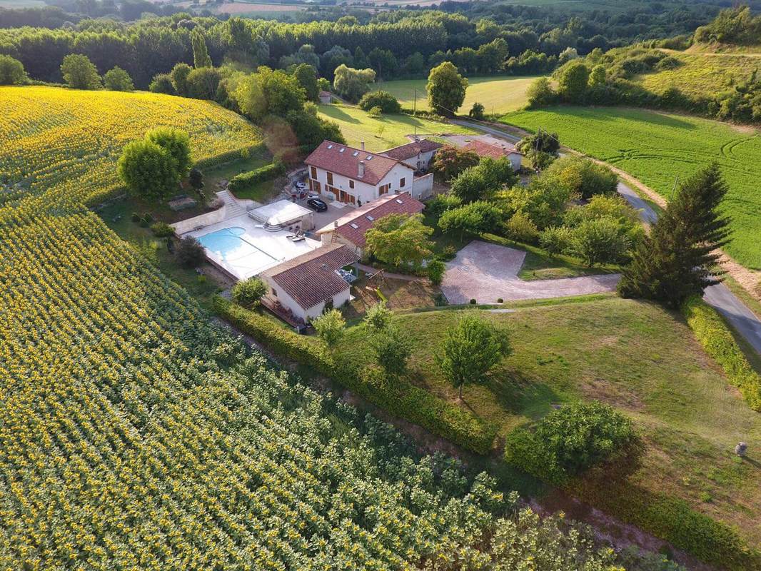
Another unique element I like to include on every assignment, is bringing the client into the project. I love the passion and excitement that comes from incorporating their ideas and suggestions into the final piece. Working with clients throughout the process allows them to be part of it and ultimately enjoy the artwork at a deeper personal level. Ok, I know we will have some detractors here either a) the person who says 'I want something of Cre8iv Edge's not my own... to this I reply ' You are getting Cre8iv Edge's unique artwork aligned to your inner images & mine, or b) the person who says ' I like to go into a gallery and chose what I like' to this I would say 'The reason you like a piece of artwork is due to the images inside your head and the emotions and values you have attached to these throughout your life! and it is these images and emotions I want to draw out and incorporate with you'. Ultimately, if I were producing [which I plan to next year] a collection of my own artwork for exhibiting, then these would be for a wider audience and based purely on my inner feelings, thoughts and how I choose to express them. This is not the case with commissions, illustrated more than ever in this painting. I visited the property myself last summer to walk around it and absorb the location [as I knew it would be prominent in the final design]. After returning to the UK, the client decided to use his new drone to take some aerial images of the house and surrounding fields. I was over the moon when I saw the two images he took below, as they gave me the perfect angles needed to complete my Dordogne composition.
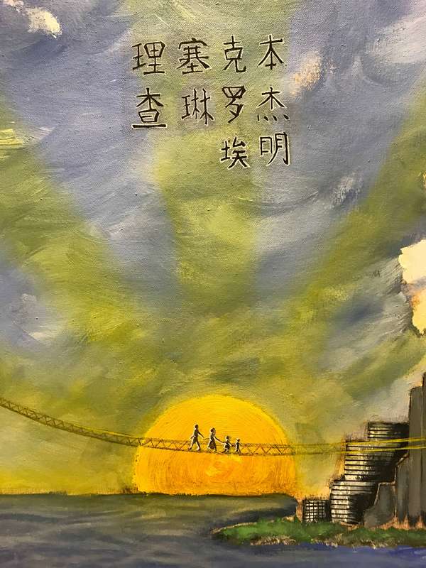
You can see in the video at the base of this post, that I also utilised a primary school taught technique for staining the canvas - soggy tea bags and a flaming lot of them lol. Although this was time consuming and you can only glimpse small areas through the clouds and buildings I am glad I spent the time on this. As you can see from the images below, the canvas gradually emerged. I made a conscious effort not to plan the final layout, I did have a rough idea but I wanted to go with the flow and address composition and add additional elements as we went along. I wont call out all these additions, however I will explain that the writing above the 4 figures walking across the bridge is the families first names in Chinese. While the writing on the side of the canvas was a quote that was personal to the family - 'petit a petit l'oiseau fait son nid' = Little by little the bird makes its nest.
I have just realised how long this post is, so let me wrap it up by saying that I loved putting everything into this piece. At times I wanted to start again, at times I thought I was in purgatory, at times I was covered in oil paint which somehow got everywhere even in my ears, at times I questioned my abilities to deliver what I had in my head.
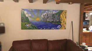
BUT.... as you can see from the photos above it was completed, delivered and hung in the Dordogne. I loved building the sunflowers and cliff into the edges of the canvas, I loved adding the sunbeams, I really loved fluffing the clouds, and most of all I loved working with the Wright family. I hope they like it as much as I do, I hope Hokusai doesn't mind me basing the waves on his, I hope to visit the Chateau this summer to see it, I hope my hair grows back lol, and I hope you liked retracing my steps with me. Thanks for reading. Lee x NB - This is a video of one of Cre8iv Edge's latest painting commissions, the short clip shows the end to end process; from building the canvas, drafting initial concepts based on client discussions, through to realisation, delivery and installation in the Dordogne.
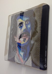 Hi Folks, I just wanted to do a very quick post about my latest painting. 'Corporatestash'..either Corporate Stash / Corporates Tash was born out of the Oil Painting course I did during the summer of 2011, at Chelsea College of Arts. I wanted to challenge myself during the course and thus decided that not only would I use a palette knife to apply the oil that I had never painted with before, but I would also chose to do a portrait with multi-coloured tones (which can drive you a little doolally). I must have scraped the oils off at least 4 times before I was even marginally pleased with the combination/composition (as you can see below).  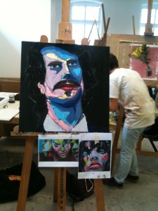 Now, the oil paints and associated tools were bought post course, in order for me to finish the piece in the weeks that followed. That deadline was not achieved and two years later it lay in the studio all sad and lonely! During a cathartic cup of tea on Friday night I threw off (not my clothes... a few of you were going all dreamy eyed there.. dirty feckers) my procrastination chains. I had no plans for the painting (which is unusual for me ... I liked it) and just sat down surrounded by my oils and brushes etc. I initially toyed with the idea of removing the moustache but as someone in my studio makes and sells moustache wax for a living, I decided to see where it took me. The more I mulled this over, the more I felt it was an essential part of the piece, namely; it provided a subtle reference to the growth of non-conformity amongst a hierarchical structure (the original image was one from my 'Growth' photography project - see earlier posts). This worked very well in conjunction with the dark and light sides of the face - which I accentuated to depict an internal conflict. I recently saw some artwork that utilised a halo effect and decided to experiment with this myself. I ended up settling for white, as it gave an innocent almost heavenly aura to the subject and it was applied in a cross hatched effect to very very subconsciously represent a cross roads (which is utilised in rock and roll photography to show a decision point/ new journey). I then spied some mesh in the corner of the studio which I had lifted (legally officer!) from the work site below. I let the mesh idea percolate over the weekend and came in on Sunday to cut two sheets, I played with these until I was happy with their position and the message it was supposed to add to the image. Which is an idea of confinement behind hierarchical structures, spreadsheets and the digital age. I decided to leave a gap between the two sheets; so we can see the true colours behind and the subject can see out (when viewed at an angle you can see the eyes separately). To me referencing Plato's 'Allegory of The Cave' - e.g. we have been brave enough to peek out, change is a good, there are new wonders to explore and all we have to do is step out. At this point, I thought the image was complete but on observing another studio member working with some spray cans, another idea was ignited (a bit like the opening scene to Mission Impossible!- http://youtu.be/k55NuWQCh78). I used gold spray paint (to represent wealth and which compliments the yellow) to create very basic side profiles either side of the subject giving the impression of him being observed, guided, moulded, controlled. Ok, its 11pm, the studio is like a sauna and if I had been alone I would have written this in my pants. I have to leave you all as I have to head back to one (Cheshire-rian for home) to pack for the Muirfield Open Golf Championship - look out for me following the players around the course with a BBC microphone!! Laters Alligators! Edge   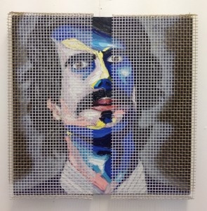 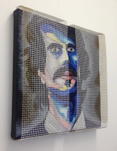 I have unfortunately taken my eyes off the ball over the last few weeks with regards to my website, blog and artwork commissions. I put this down to the elation of no longer being mistaken as a peg legged pirate, having regained the usage of my right knee bone leg bone (e.g. no more crutches) and the start of the World Cup. But the proverbial finger has just been pulled out! The still life sketches shown were unearthed by the Parents' Edge while recently clearing out their loft. I did these while I was a young 14/15 year old whipper snapper attending Tarporley County High school in 1991/2! It was very weird looking at these for the first time in 18 years, as I vividly remember doing each 1; where I was sat; what I was wearing (ouch.. dodgy shell suit bottoms at 1 point); the enjoyment combined with the internal battle against all things homework. Developing my website and blog allowed me to document and understand my interests/progress/inspirations etc in a lot more detail. Seeing these drawings again allowed me to relive the enjoyment and passion for art through my 14 yr old eyes. Which led to me conjuring up images of straying from the path and finding may way back after many years, experiencing life but coming back full circle to where I was as a 14 yr old - with a burning passion for art. A little deep for a blog, lets just say now I'm concentrating on my art, it just feels right... like it did when I was drawing these sketches, thats why I wanted to share them. Edge... over & out PS - for those of you who don't remember --> 'The Wonder Years' 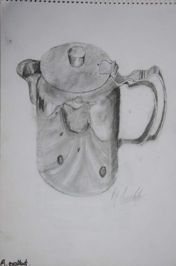 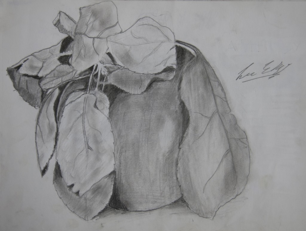 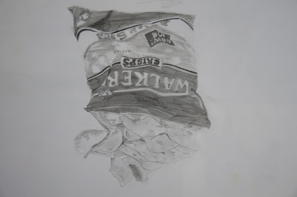  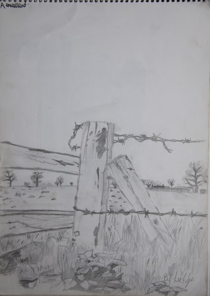 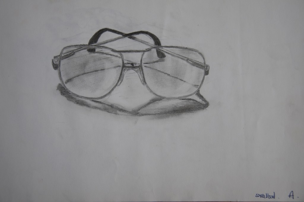 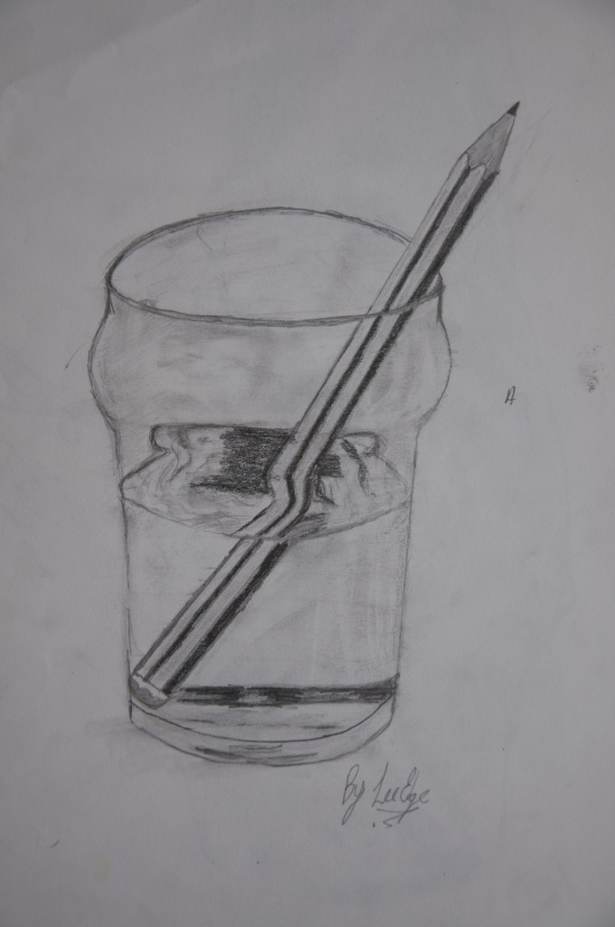 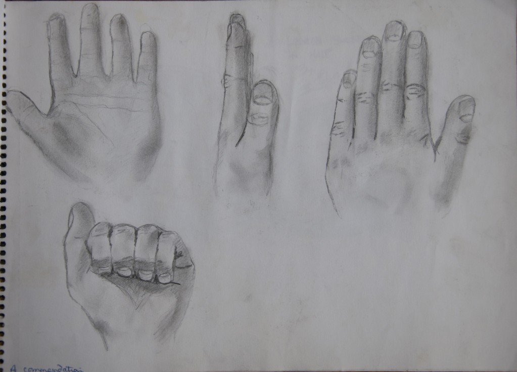      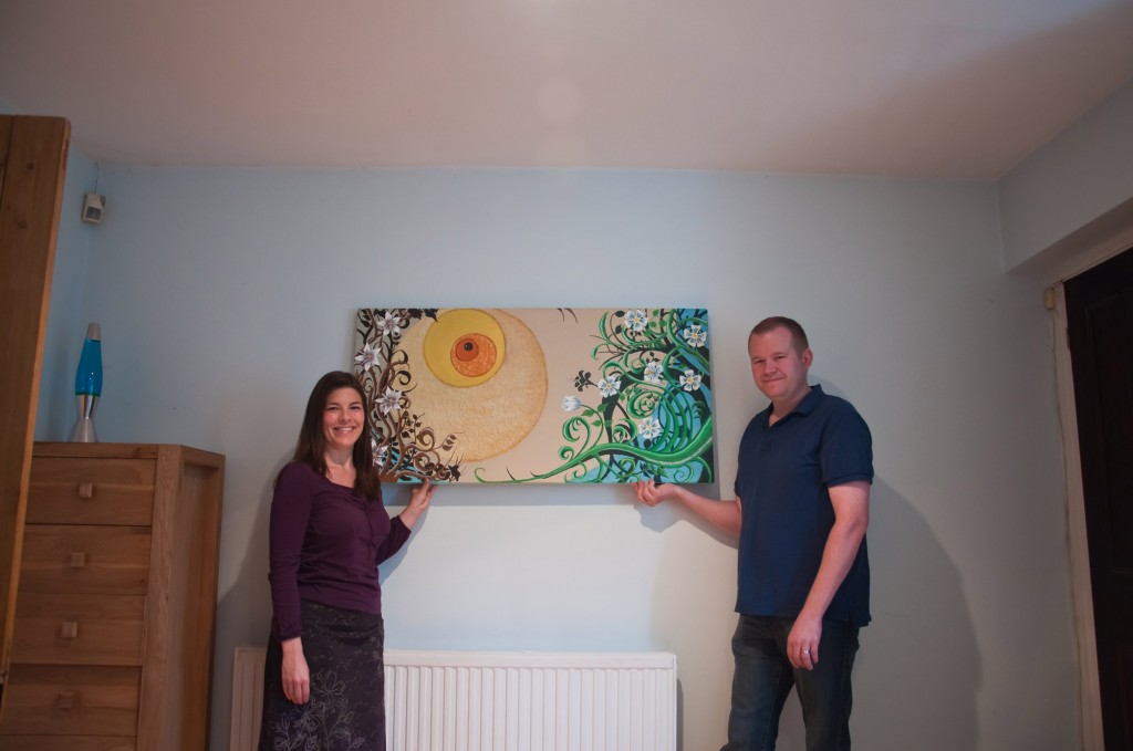 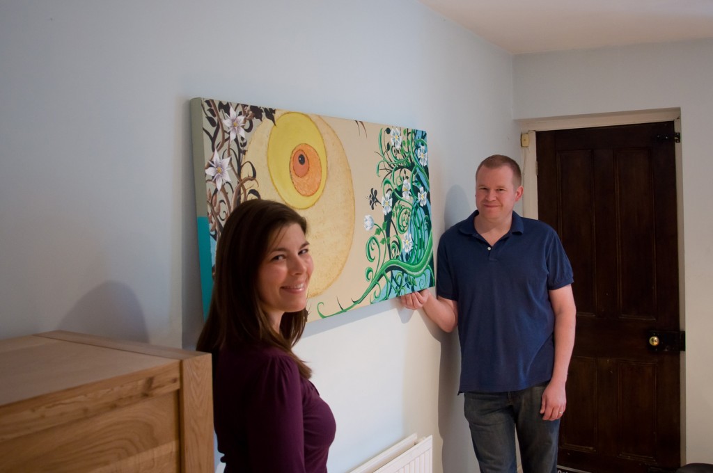 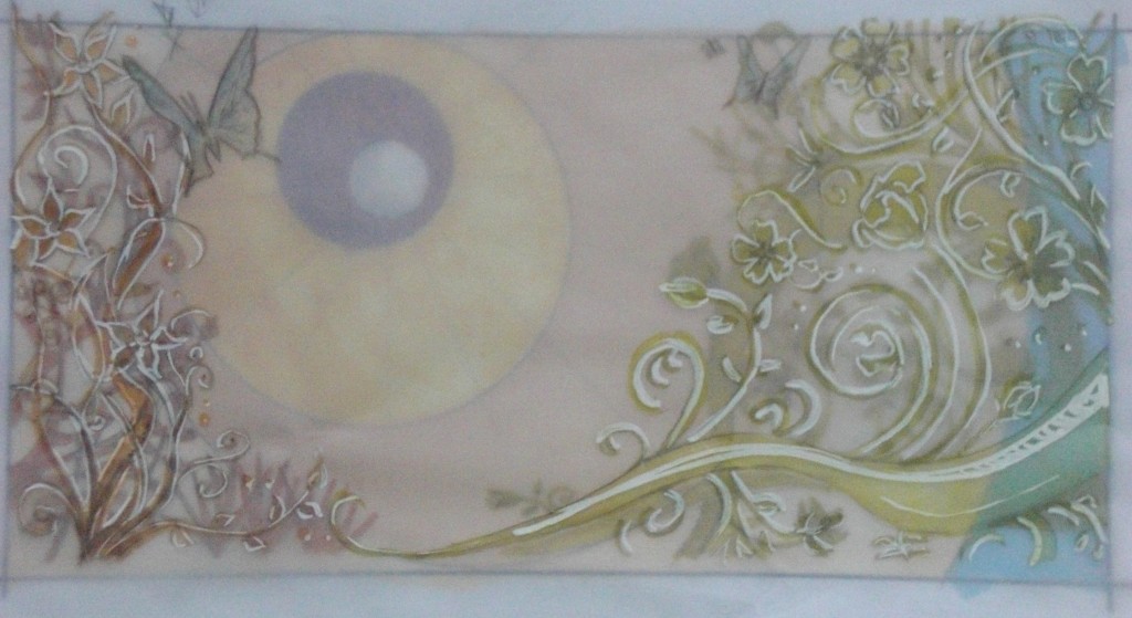 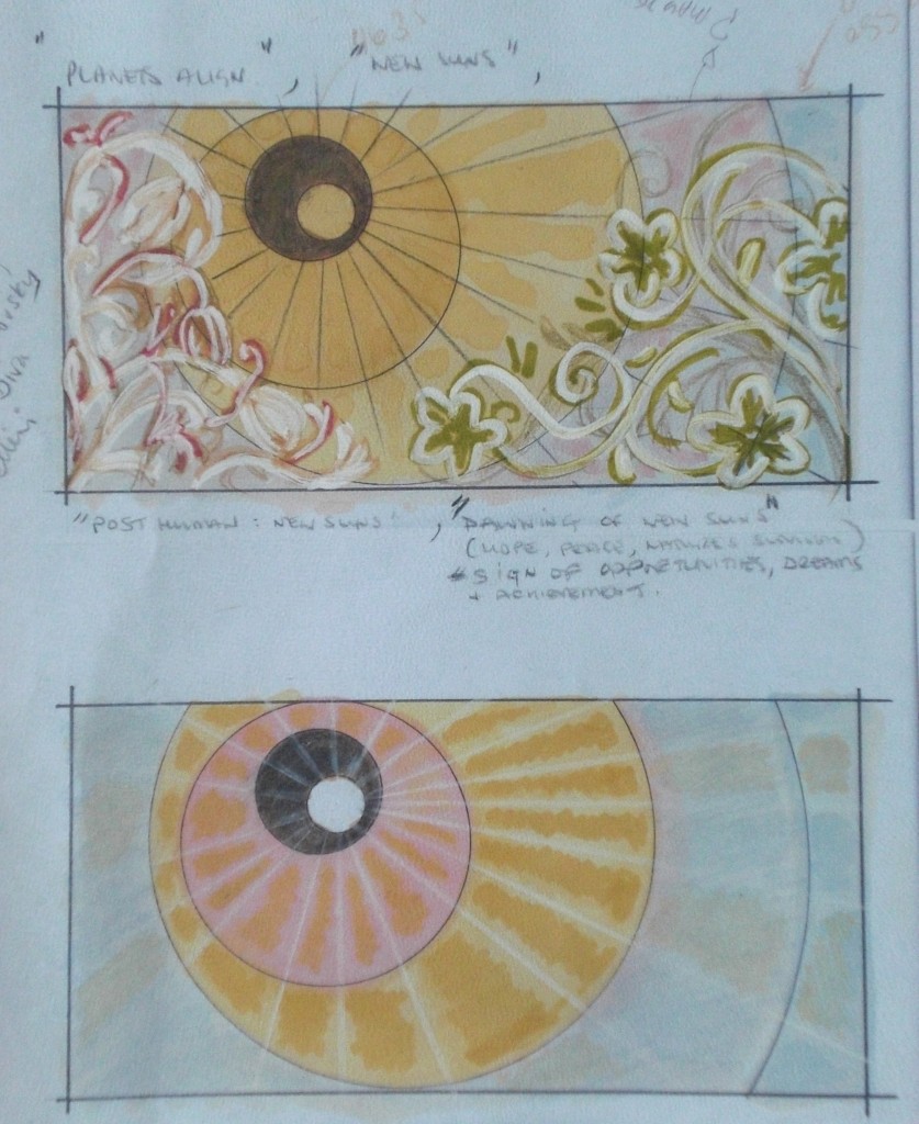 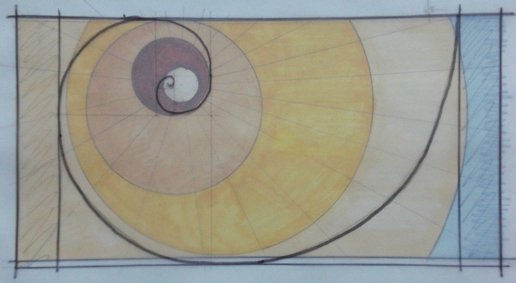 Hi All,
Just a quick post to share a few photos of my latest commission, which I delivered this morning to a client in Greenwich. This was an interesting project for me to undertake as it was very conceptual, compared to past briefs. The client wanted a large canvas for her living room which complimented the current colour scheme and worked with the existing layout. Through initial discussions I was able to gain a clearer picture of the kind of design she was after (e.g. autumnal colours, flowers and a duck egg blue undertone). I am currently reading the Art Spirit by Robert Henri, who describes how you should structure a composition. He conveys the need for a clear meaning & approach for sharing that meaning before starting any piece of art, be it a portrait, landscape or abstract. It wasn't until Lisa mentioned the purchase of a large circular mosaic mirror, that would be hanging on the opposite wall to the canvas, that the composition came to life. Using the basic shape of the mirror, I was able to replicate it through the design using the Golden Spiral (you can see how this was achieved above). I have read a lot about the old masters and their use of the Golden Ratio (Golden Section, Golden Spiral, Golden Triangle etc). At least since the Renaissance, many artists and architects have proportioned their works to accommodate the golden ratio, believing this proportion to be aesthetically pleasing. The golden ratio has fascinated intellectuals for supposedly at least 2,400 years, with the ratio actually linked to the building blocks within nature itself... (the ratio is often denoted by the Greek letter 'Phi'). The photos of preliminary design work illustrate how I developed a concept around the Golden Spiral and framed this with the foliage and background silhouettes. A further undertone to the design is the use of the circular pattern to represent an alignment of planets (e.g. that unique moment where everything is perfect), with the foreground flowers and the dark silhouettes behind both reaching for it. Some venturing off from the path and exiting the canvas, while others compete for the central space on the canvas. I also wanted to achieve a colour palette which went from a cool duck egg blue to warm yellows and oranges, to symbolise the warm rays of light. You can see how the finished piece was received and how it will hang in Lisa's living room above. I hope she enjoys it and believe it exceeded her expectations (well I hope it did .. I will have to wait until I receive some formal feedback for the website ... ) Dam this has turned into a large post ! If you have made it this far ... I thank you for your commitment to the cause & hope you like the artwork/post! Adios mi amigos, Edge Good afternoon, to all you fellow creatives* where-ever in the quantum field you chose to be at this juncture, * - which is all of you, as I believe we ALL posses this ability! The main reason for starting this blog was to empty my... stealing a metaphor here... 'technicolour dream 'brain' of many colours' of its thoughts, musings and ideas, in order to incubate and engage with them in a proactive way. An added bonus being that the spin cycle could be reduced from a mach 1 full overload to something more productive. I have it seems though, ended up writing longer rather than bite size pieces so over the next few weeks I will be addressing this with a few smaller exhibition reviews and current project updates (I will however be continuing with longer more involved posts too). I recently completed, for three separate clients, three special edition prints of a commission I did 18 months ago for a retiring Senior PwC partner. One of the canvases, was a huge 40inch by 40 inch that had to be shipped to Zurich, Switzerland (which in itself was a learning curve due to customs taxes). 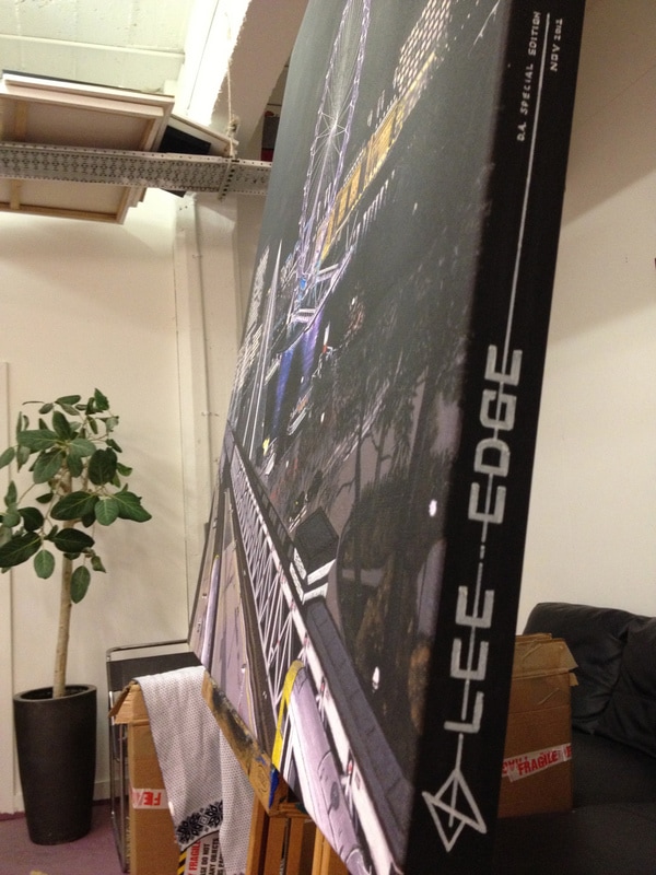 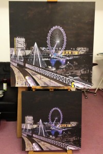 The original painting was professionally photographed before it was presented to the retiring partner, so I was able to send this off to be printed and framed. The printing and framing of the 40x40 inch canvas alone was a whopping £150. I new before they arrived that these were going to be special editions and by this I don't mean just signed and classed as 1 of 200 etc ! Special edition to me, means putting even more effort into the canvas producing a more detailed variation of the original with unique brush and pen strokes. 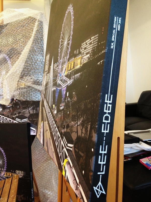 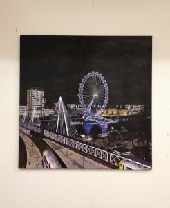 All three special editions received equal amount of attention and I found the process quite liberating, as it allowed to to address a few elements that niggled me in the original. The additional detail was added through acrylic, pen and ink work which allowed greater control over the London Eye and bridge cables. Further detail was added to the cloud formation to ensure if popped out (as this had been lost through the print process), the individual cabins on the London Eye, the South-Bank promenade and the train platforms. The moment my canvases are packaged for delivery is one of mixed emotions ! There is the excitement and elation at finishing; that pesky ego rabbiting on about them needing more work (dam you you evil scallywag you! and for your information Ego your presence is accepted as part of our evolutionary past, but your views are no-longer required); and ,the anticipation of how it will be received. All three customers received their canvases in good time, although myself and Donna did have some fun getting the 40x40 inch canvas too Zurich! Photos of the prints, with smiling owners, in their new homes will be uploaded on receipt. As always any comments gratefully received. As the great Dogtanian once said in the 80's ! All for one and one for all !! Togetherness will help society conquer selfness (the ego) and allow us to return back to oneness (essence of our inner child without any negative beliefs)!! Altogether now .... OMMMMMMMM <- Hindus believe that as creation began, the divine, all-encompassing consciousness took the form of the first and original vibration manifesting as sound "OM" (wikipedia).
Edge I am loving this chaps technique !! I have been experimenting with plexiglass recently using similar techniques, although mine will have another dimension!.
Watch this space..... I have attached some photos of my latest painting commission. I was commissioned by 3 individuals to do a painting for a Senior Partner's retirement gift. His office over looks the Thames and the view is slightly obscured by the structural supports, the central balcony and hundreds of pigeons and their individual markings :) I therefore carried out a photographic study from the balcony and present them with a few compositions to chose from. I am intrigued by perspective and how in reality architecture can shape and control the spacial awareness. Having studied Urban Design at Nottingham, I have some understanding of how the architects seek to achieve this via tight streets opening up into wide squares or the use of vistas to guide peoples movement/focal points etc. Like the architect, the artist should also seeks to take you on a journey through his picture. I attempt to draw the viewers eye from the rail track to the left, where it should then be drawn through the centre of the painting by the outline of the Southbank to the main focal point of the painting (the London Eye), finally finishing on the dark silhouette of Westminster Bridge on the right hand side of the canvas. The finished piece took 50 hrs to complete. It was presented by the head of the firm to Mr Jones at his retirement presentation. It is always an amazing feeling to finish a project but to see it presented in this way was fantastic, it was like having a mini exhibition as people were chatting to me after the presentation about my artwork etc. My dream of holding my first exhibition is now even stronger !! 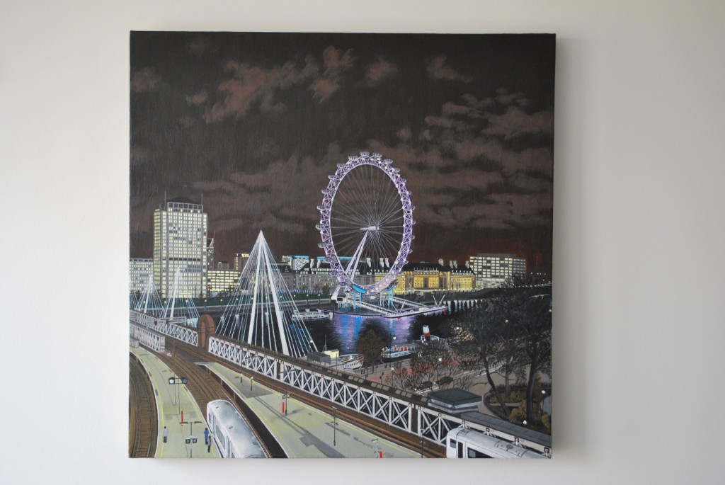 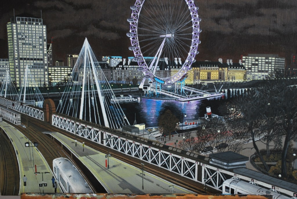 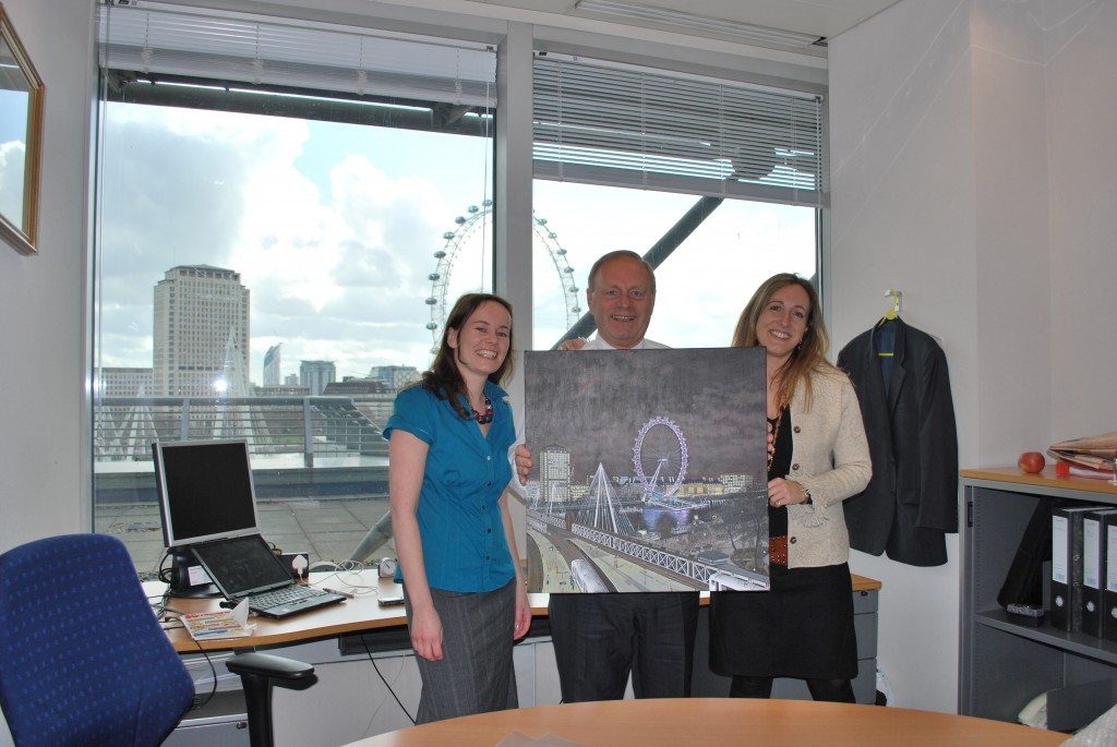 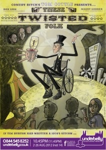 Well hello ladies, gentleman and others that are either in between or both (no not Nicole Kidman surely...), As you’re all aware the London 2012 Olympics arrived and the atmosphere in the big smoke was absolutely electric! If you had listened to the news and media (neither of which I give the light of day) for the last 2 years, this was going to be the biggest embarrassment this country had seen since Peter Crouch put on an England shirt! It seems for once this ‘Great’ Britain of ours dropped the over the top negativity that has seeped into every pore of society for the last 20 years (apart from the financial world who have been having a ball at our expense until recently). But even they have been put through the mill in recent times... well that’s if being put through the mill is a Senior PwC partner’s wife writing a blog about having to let go of the nanny! This is GREAT Britain and I’m loved every minute of the Olympics! The opening ceremony was amazing and exceeded all expectations. Ok… rant over…. actually one more thing … BORIS for Prime Minister!!!!! Now back to the main programme. The Edinburgh Fringe Comedy Festival came round again in August and it is one of the most amazing experiences you can ever have. You can pretty well immerse yourself in 24 hours of comedy non-stop for a month; supplementing sleep for copious amounts of alcohol, deep-fried mars bars and pizza. I was lucky enough to be introduced by my very talented friends SHIRLEY & SHIRLEY who are doing there 4th year this year (see a link to their site opposite and go and see them as they are sweet as a nut in a bag of sweet nuts and my Cantona shirt from the 1992 season makes an appearance! Not to be missed). I have made my way up to the Fringe, imposing myself on the Shirley’s, for the last 3 years and I have had some very memorable moments… nothing can beat randomly ending up on the razzle with Hunter the Gladiator, him trying to set you up with his co-star Abi Titmus! He wasn’t able to find her, got smashed and then he was thrown out of the bar = AWESOME night! It was through these visits that my latest commission came about (yes.. your deductions are correct Sherlock… I have only just managed to get to the point of this blog post!). During my time in Edinburgh I am lucky enough to meet and be surrounded by people doing what they love every day for an entire month – working hard every day to fill their venues and perform day in day out and party like beeeaaatches every night. I was and still am in awe as the buzz is better than any drug ….. a friend told me about the comparison obviously! In 2009 and 2010 ‘Comedy Bitch’ went up to Edinburgh festival. With their surreal mix of dark, yet oddly naturalistic humour they had some fantastic reviews and I was lucky enough to get to know all 6 of them. I was approached in early 2010 by the troop to put together some concept sketches for their 2010 show 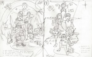 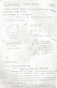 Unfortunately, their management team vetoed the gang’s idea and went with a photographic montage (L…Hooooooo…Ssssss…Heeeeerrrrss). This year though Mr Tom Cottle (one of the Comedy Bitch performers and writers) decided to go out on his own and take a little jaunt into the world of one-man shows. He created his own unique mix of oddball characters, with an array of human insecurities and was in need of a poster to convey this dark League of Gentleman-esk world. The initial brief was indeed that, brief, as our interaction was through a few emails. Tom sent through some example imagery, something I always request, so I can start to understand the type of picture a client has in their head. It is my job throughout the project to continually draw out what the client has in their conscious and subconscious, as only then will I succeed (like a parrot without a beak) to exceed their expectations. He also sent through the working script for the show and the fact he would like some homage to Quentin Blake, Tim Burton and the poem from funny bones, ‘On a dark dark street, there was a dark dark house, in the dark dark house…’. Do any of you remember this children’s program? 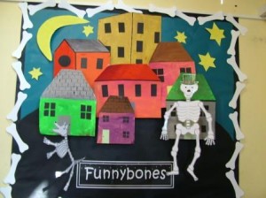 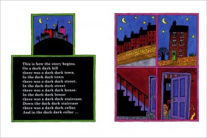 The main character of Tom’s spectacular show was born with baby girls hands, has extremely long appendages (see images below), was disowned by his parents and went to live in a circus as a toddler tight ropewalker, had an affair with the ring masters wife, became an airline pilot, is now 82 wheel chair bound and lives in a block of flats below a family of blind glass blowers and to the right of 3 heads (that’s right just heads)…. It has similarities to a plot straight out of an East Enders Christmas special no?  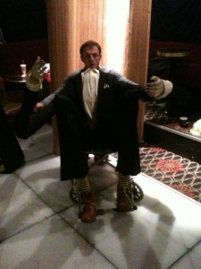 At the time Tom approached me with the commission, I was just finishing Dante’s Inferno and there were some strong ecclesiastical symbolism from this classic text that I felt might work in the composition. Although in hindsight I may have made the classic error of trying to shoe horn current influences into a new project. You can see from the initial sketches below how I worked in hell and purgatory (as I presumed from the initial information that this was what the show might but subtly referencing), burning souls (yes a little to deep me thinks) and the journey to paradise (ah…that’s better). 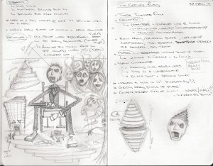 Following our first meeting, I was able to gain a clearer understanding of what Tom was looking for. He took me through the play in more detail and I imbibed the dark comedy vision he had and developed further concepts sketches: a. Working with silhouettes’ to play with Mr Twist’s body position; b. Bringing in the elements that will have been described above (e.g. baby girls hands and the wheel chair); c. Developing my idea of the twisted sperm as a subtle reference to his twisted birth/past and how the hill he is positioned on could be the egg; 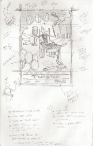 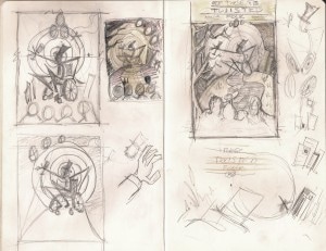 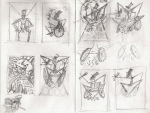  During our second face-to-face meeting we discussed the draft concepts in more detail and on reflection we felt they were to close to a Tim Burton moive poster. This was mainly due to the twisted tree on the left of the poster but also the main character himself (Mr Michael Twist) resembling the characters body from ‘A Nightmare Before Christmas’. Although we wanted to keep some reference to this style, so further thought development and greenhousing was carried out (no negative closing of ideas were allowed) and we were able to shape and mould the concept over some Sunday Guinness’s in a bar opposite Mornington Crescent tube station. 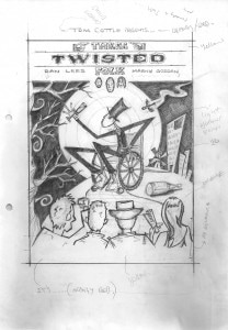 The circus big top was an element Tom felt we needed to bring out and I was intrigued to use the toddler tight ropewalker to lead the eye to the central characters face. The composition was now coming together; I felt all the elements were in place e.g. they all framed the specific focal points and ultimately led/drew the viewer subtly to the centre of the poster. For example the twisted swirl of the moon/sperm, the smoke and tail, the twisted path to the two supporting characters in the show played by Dan Lee and Marny Godden (bottom left and bottom right of the composition). With the top signage also reflecting the colour of the Underbelly banner, something I wanted to do to balance up the composition as I haven’t seen this on other posters over the years in Edinburgh (perhaps for good graphical and illustration reasons but I am a rebel!!). 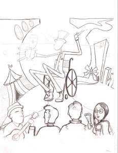 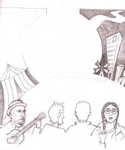 Now this is where the course of the project took an unexpected detour outside of my comfort zone! While discussing the commission with my friend and Mr Miyagi of the animation world, Mr Andrew ‘I will demonstrate how to deep fry a Mars bar on youtube’ Morgan. He encouraged me to use the Wacom Cintiq graphics pad I had bought 10 months previously and had only used to-date for touching up the images for my ‘Growth’ photography project. The transition from the comfort of my pencil, ink, paper, and acrylic to a completely digital media was not easy. I had to absorb skills and tricks like a sponge as Andy kindly did some initial demonstrations. Luckily I am reasonable up to speed on Photoshop and although I hadn’t used it extensively since the Growth project, I was able to pick it up quickly. Once I was able to grasp the under drawing elements needed in order to build up the illustration I was hooked. Unlike completing the illustration on paper you are able to correct elements easily and experiment with colour schemes and positions throughout. Due to the somewhat high expectations of myself in everything I do, this was a steep learning curve, as I wanted the final piece to stand out in Edinburgh. After many late nights, incorrectly saved files, lost layers, lost scruples and many journeys from A to D to C to Z to eventually get to B, I had a final composition I was reasonable pleased with. 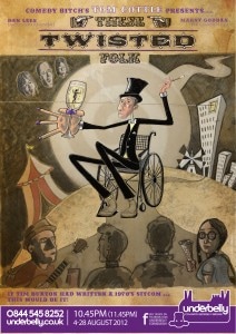 Although the project was not yet complete as there were still a few final additions that needed to be made. I made some final colour amendments and we also had to build in the Comedy Bitch ratings, as well as produce a back for the show flyer. During the Sunday Lunch and Guinness meeting mentioned earlier, we hit on the idea of using the flyer as an invitation to the party Mr Michael Twist was hosting every night throughout the Fringe. I felt this would allow Tom and his fellow flyerers to add something more personal to the street interactions (writing the individuals names on the invitation etc) that would hopefully improve the attendance to flyering rate. We also had to include some information about the show and more quotes from the Comedy Bitch shows.  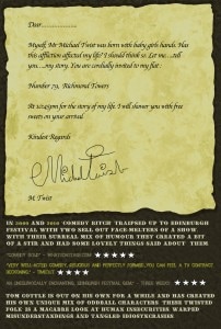 Following a few minor technical issues in getting the final images to the printers, the posters and flyers arrived in Edinburgh in good time. I made my planned pilgrimage to my beloved Fringe on the 16 August! Mr Cottle himself kindly allowed me to crash on his sofa, for which I am very grateful. I can only apologise for the smell of vodka redbulls and half eaten chicken kebabs. My 2012 adventure was too short, 3 nights just isn't enough to see all my friends shows, party it up in the Loft Bar/Abbatoir/Brooke's bar, see the 'Peat Bog Faeries' Live (see video below), etc, etc..... that said it goes down in the Edge history files, as yet another amazing comedy extravaganza !!   I was very proud to see the poster on the wall in the Underbelly and around the rest of the fringe (as can be seen from the cheesy grin-ster above), I was caught trying to post them all over Edinburgh castle and Arthur’s Seat! My argument of ... 'I still think it belongs to the English' ... didn't go down to well ha-ha. The local fast food outlets also refused to hide them inside their deep fried mars bars/pizzas/chips/sausages/lettuce (you name it it gets fried up there!) like a Wonka golden ticket and the locals would not carry them around in their sporrans!! My gorilla marketing needs some work :  If you made it this far I hope you enjoyed reading about my latest commission. This was one of most rewarding and enjoyable commissions to-date, I look forward to many more in the future. I have opened up the blog for comments so any feedback gratefully received.
… KIRK OUT …… PS – Check out the Shirley and Shirley’s link to the right of this article and one of their many great reviews from the Edinburgh Fringe ! Four stars baby !!! http://sgfringe.com/2012/08/07/shirley-and-shirley-unleashed/ By Lee Edge | Published on DPG website 23 Dec 2011 http://dulwichonview.org.uk/2011/12/23/%E2%80%98hot-mush-school-a-canadian-education%E2%80%99-tom-thomson-and-the-group-of-seven/
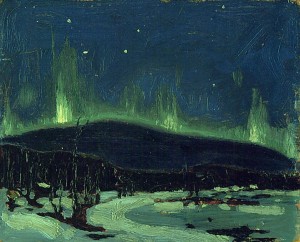
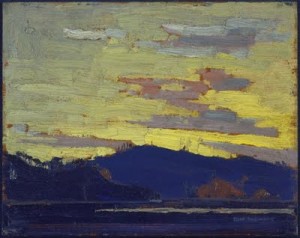
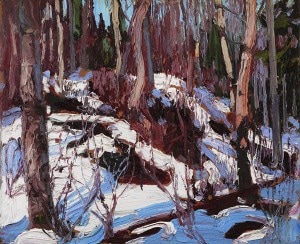
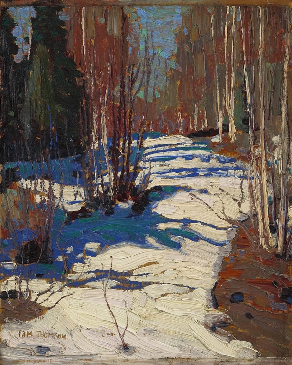
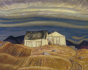
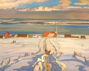
In keeping with the great writer, adventurer, soldier, freethinker, con man, gambler, gourmand, violinist, spy and legendary seducer, that was Casanova; I would like to open this review with a brief synopsis of myself, as only then will you be able to fully appreciate the – what I hope to be, insightful and cathartic – prose that lies before you. Having had a passion throughout my younger years for art I obviously chose, as any aspiring artist would, to down brushes and enter the London corporate establishment. The lauded draw of the strong career prospects and a reasonable salary outweighing the ‘draw’ of my pencils. There was always a creative calling inside me fighting against this self-induced tyranny. I eventually realised that art was my true calling and have since been focusing all my energies in this area of my life. The Tao Te Ching (6th Century BC Chinese philosophy) states that if you follow your true destiny, the world will conspire to help you on your way. With this in mind, it was in a day lost in the wonders of Dulwich Picture Gallery, that an opportunity to write this review presented itself… Introduction: In the early 1900’s only 7 million people lived in Canada although it was the second largest country in the world geographically. It was during this time a group of artists started to engage with the Canadian wilderness; a landscape previously considered to be too wild and untamed to inspire true art. This Group consisted of Tom Thomson, Lawren Harris, J.E.H. MacDonald, A.Y. Jackson, Franklin Carmichael, Fredrick Horseman Varley, Frank Johnston and Arthur Lismer. Most of the Group were professional graphic designers, and had at some point worked at the same firm ‘Gripp Ltd’, after studying in Europe. In my mind, I see these intrepid painters riding across the Canadian frontier like Billy the Kid and his gang – Sheriff Thomson and the Magnificent 7! Paint slinging rather than gun slinging. The Canadian art establishment did not warm to Tom and the Group’s work. A critic once said of one of MacDonald’s paintings it reminded him of the ‘…inside of a drunkards stomach’. Another described the Group as ‘Hot mush school’. So, let’s now go and explore the hot mush of these drunkards’ stomachs! Tom Thomson The first room is dedicated to Tom Thomson who only started painting in his 30’-s and had little or no training. Thomson was as an outdoorsman; he had a reputation as a keen fisherman and a skilled canoeist. He had an inner connection with Algonquin National Park and was drawn to its wild beauty. ‘Exhilarating sense of direct communication with nature…thrill of eternal aspiration in this fondness for great, open spaces, and the magic radiance of the arctic aurora’ (Painting Canada) The sketch box he used, when hiking, is on show on your left as you enter the room. To me it is a work of art in itself, nothing captures the roller coaster ride of emotions a painter experiences throughout a piece of work than the palette itself. The sketch box for me is an extension of Tom and I spent 10 minutes looking at every visible colour and stroke. There were 7 of Thomson’s paintings that stood out from the rest of his work. The first – though not my favourite – sums up Tom’s approach to his work, while it also has a dark side as this is the lake he drowned in under suspicious circumstances, in 1917. Evening, Canoe Lake was completed with strong brush strokes and thick paint. I could almost picture myself stood next to him as he painted the scene, wind whipping around him, an overcast day with a melancholy dampness in the air. It surprises me how much I like it, as like many of the pieces in the exhibition it is more abstract than my usual tastes (although as I am trying to move away from photorealistic work myself, I am starting to appreciate deviations more). This is probably compounded by the fact it isn’t at face value a very attractive scene or composition and there is a purple tone to it, which has not been my favourite colour since I was forced to wear an awful purple shirt as a child! But it reminds me of a quote from The Tartar Steppe by Dino Buzzatti written in the 1930s: ‘Only the poet or the saint can water an asphalt pavement in the confident anticipation that lilies will reward his labour’ (Dino Buzzati) 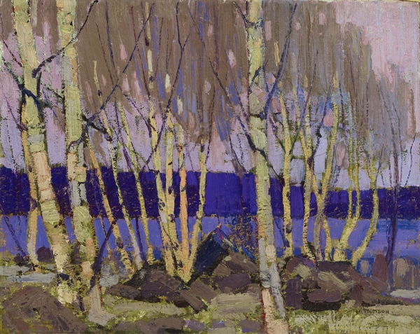 (Evening, Canoe Lake, 1915–16, Oil on canvas, 41.3 x 51.5 cm) The next painting is Burnt Land which was tidied up from the original sketch with Tom removing some of the trees to present a stronger final composition. The scene reminds me of the Tartar Steppe desert within Dino Buzzati’s novel; which was a sparse, desolate, open, isolated, wilderness that drew you in with its mystery and magic. The yellowy sky and dark silhouetted mountains present a strong backdrop only broken by the bare trunks of a few trees. We now come to my favourite two pieces by Thomson: Northern Lights and Yellow Sunset. There are some painters who deal with the play of light as the most graceful thing that exists. Thomson does this by: Weaving moonbeams with his fancy (W. Somerset Maugham), Northern Lights has an ethereal beauty due to the dark blues of the landscape shrouded in shadows and the chill of the starry night sky, separated by a spectacular green aurora borealis. Yellow Sunset in contrast fills you with a feeling of warmth, the enticing yellows dominating a third of the composition, with a fantastic silhouetted landscape covering the rest. The final three pieces (Winter in the Woods, Path Behind Mount Lodge and Winter Thaw in the Woods) from Thomson have a related theme; they are all tight compositions of woodland. They give you an instant feeling of being lost in deep winter within the Canadian woodland. He uses the contrast of light and dark majestically to portray the winter sunlight and the long shadows. Tom Thomson was in the ideal frame of mind for an artist, his objective was not to make art, but to be in the wondrous state that made art inevitable! 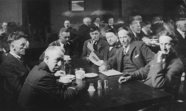 (The Group of Seven seated around a table at the Arts & Letters Club, Toronto, c. 1920)MacDonald has a stronger intensity of colour in his sketches and actually steps down the palette for the final canvas of one of his best pieces The Beaver Dam. I actually prefer the colours used and the more haphazardly daubed oil work in the sketch. Maybe he was conscious of not wanting to emulate Thomson too closely. Although I preferred the more abstract Beaver Dam, his painting in Algoma Falls, Montreal River is exquisite with its background detail. It is another skyless image; that prompted me to do a quick re-examination of the Group’s work, which allowed me to notice that the sky is either absent from compositions or forms an elaborate patchwork quilt of colours. At no point is it in frame and plain like in many present day landscapes. Carmichael in my opinion was more polished than MacDonald, his colour palette was warmer and he used his foreground detail to greater effect. Although the foreground in October Gold contrasts with the Harris-esk abstraction of the background, it is a powerful piece. The depth of the background could have been achieved more successfully had he gradually toned it down but its almost cartoon feeling achieves it in a different way. But by far my favourite piece of Carmichael’s is Grace Lake, with its outstanding composition and use of central detail to hold your gaze. On viewing Jackson’s First Snow, Algoma I was struck by how hard the silhouetted trees are to pick out. They are like the figures in an old tapestry; they do not separate themselves from the background, and at a distance seem to lose their pattern, so that you end up with a small but pleasing patch of colour on the overall canvas. Night, Pine Island is a much improved piece of work, although to me it is a little too symmetrical and resembles a melted face viewed from chin up. Some of my favourite paintings in the collection were produced by Jackson 6yrs + after First Snow. Winter, Quebec and Le Calvaire or Wayside Cross, Saint-Urbain are fantastic works and remind me of the paintings by Flemish renaissance painter Bruegel the Elder. His A Quebec Farm held me spellbound by the use of the contours of the field to lead you to the farmhouse and the way the sky holds you there. 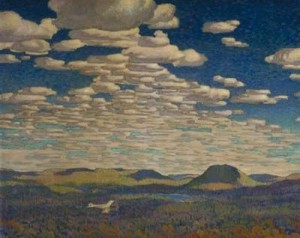 (The Fire Ranger, 1921, oil on canvas, 123 x 153.2 cm) Lismer’s Evening Silhouette is striking and reminds me of the artwork on an animated film. The use of the cloud formation to sweep the eye from top left to the right and into the centre via the tree line is sublime to the senses. Varley’s Stormy Weather, Georgian Bay is a wind-swept gem transporting the viewer into the tumultuous grasp of nature. He drops this fierce element for his Autumn Prelude, which is softer and calming, and together the two senses tease and tantalise. 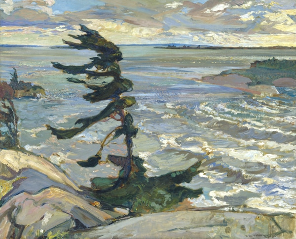 (Frederick Horsman Varley, Stormy Weather, Georgian Bay, 1921 Oil on canvas, 132.6 x 162.8 cm) Lawren Harris There is a distinct difference in Harris’s earlier works and his Mountain Mad phase (the final room within the exhibition). His later work seems to have been completed with the directness of a fanatic and the ferocity of an apostle. I imagine Harris to have been an affluent, extroverted, single-minded risk taker. This was illustrated by him following Mondrian in the 1930s by going abstract, stripping down forms to spiritual power (becoming a theosophist). The final room in the exhibition can only be described as magnificent, sublime and infinite to the senses. Beauty is something wonderful and strange that the artist seeks to fashion out of the chaos of the world in the torment of his own soul (this is a subject I have been exploring on my blog recently). To fully recognise it, you must repeat the adventure like Julian Beecroft did for his great article on the Guardian website. 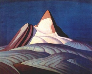 (Isolation Peak, 1930, 106.7 x 127 cm) All the pieces within the final room are outstanding Icebergs, Davis Strait, Untitled Mountain Landscape, Lake Superior, Isolation Peak and Mount Lefroy. All have been broken down to their basic constituent elements through use of strong compartmentalised colours and smooth lines. They are calming, striking and present the viewer with a glimpse of contentment for the time they spend in their company. They remind me of sumptuous scenes from the new wave of computer-animated films, withUntitled Mountain Landscape resembling a face basking in the sun. Summary: In summary the Group effectively taught Canadian’s how to see their country in a new way. ‘Artistic expression is a spirit not a method. A pursuit , not a settled goal, an instinct, not a body of rules.’ (foreword to their catalogue for the second exhibition) Viewing this collection is like being in a constant circadian cycle – that magical dream state between wakefulness and deep sleep! After imbibing all the wonderful imagery within the exhibition and my subsequent research, I suggest to you that Tom Thomson and the Group of Seven took life as it came; drank liquid elixir from the cup of their collective passion and lost themselves in their al fresco brush strokes. They consciously extricated themselves from the humdrum of society, transporting themselves into the vast unchartered frontiers of the Canadian wilderness, where Mother Nature rules with an iron fist hidden inside a silk glove. ‘Man’s desire for the approval of his fellows is so strong, his dread of their censure so violent, that himself has brought his enemy within his gates; and it keeps watch over him, vigilant always in the interests of it’s master to crush any half formed desire to break away from the herd’ (W. Somerset Maugham) The Group blazed their own trails and were not driven by the desire for approval from the art establishment. The Tao Te Ching states that you will not attain personal contentment, unless you are happy in the present and desire nothing. Perhaps this is the reason why the group were able to express themselves so vividly as a collective, because they were vibrating at the same frequency as mother nature, which allowed them to connect with the Canadian wilderness like no other before or after. Harris confirms this notion in the following quote: ‘We had commenced our great adventure. We lived in a continuous blaze of enthusiasm…. Above all we loved our country and loved exploring and painting it’ The Rage Against the Machine, Citizen Smith (power to the people), far-side cartoon (where the sheep stands upright and says ‘Wait a minute… we don’t have to be just sheep’), non-conformist in me feels a deep affinity with the Group. The Group are kindred spirits from a bygone era, Canadian rebel brothers from other mothers. 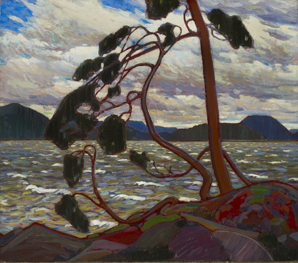 (Tom Thomson, The West Wind, 1917, Oil on canvas, 120.7 x 137.2 cm)
Experts are entrenched within their rivers of thinking and can find it difficult to embrace new innovative thoughts and techniques. This may suggest why the Group’s works received bad press in Canada. Perhaps over exposure to the images also allowed the Canadian Society to ultimately fathom the works of art… ‘A book lives, as long as it is unfathomed. Once it is fathomed, once it is known and it’s meaning established, it is dead’ (D.H Lawrence) …while in the UK they were, and still are, just paintings embraced for their mystery and magic – the UK is so far removed from this Canadian wilderness we will never fathom out the relationships these painter had with the landscape! Visitors to Dulwich Picture Gallery are applauding the artwork once again, in the UK they will never die. Painting Canada: Tom Thomson and the Group of Seven is at Dulwich Picture Gallery until 8 January 2012. 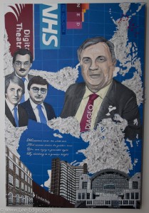 Thirty six years at one firm is a fantastic achievement, which I am sure brought with it many memorable adventures that would keep the ‘Robin Hood Costumed’; ‘Banjo flaunting’; ‘Armed with melodies o’ plenty’ illustrated BBC story teller from my childhood (…’I am a story teller and a story must be told’...) in business for the rest of his tree bound life. But being asked if I could bring key moments from this illustrious career to life on one canvas, now there was a challenge! One I welcomed with open arms. My first corporate commission (the painting of the London Eye for another PwC retiring partner’s in 2010) and the Movember Photography project, later that same year, allowed me to gain more artistic exposure across the PwC firm. It was through this exposure that I was approached by Liz Smith (Director), Dolores John (Senior Partner PA) & Chris Venner (Director) in the summer of 2011 (prior to my leaving the firm) about potentially producing a more elaborate piece for Mr Wright’s retirement. The concept was to create a canvas that would encapsulate as much of his time with the firm as possible. The collective design process: 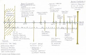 The initial seed was planted and after formal confirmation was received greenhousing sessions were arranged with the clients to gather initial information about the subject (as you can see from the attached project timeline above). This allowed me to start to visualise design options for the final canvas. Liz, Dolores & Chris were able to provide me with a lot of information about Philip’s career but I encouraged them to get someone to interview him under the premise of a partner exit article (as the artwork was a surprise gift). 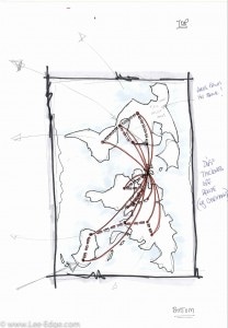 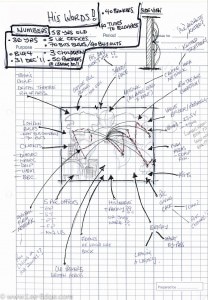 In the meantime, during the ‘Nurturing’ phase of the project, I began to mock-up a selection of concept sketches and ideas (a few of which can be seen below) to present back to Liz, Dolores & Chris and to work with them to shape them further. Many people see the development of a collective vision as an impossible task, I disagree! Involving everyone in the process and shaping ideas together is a rewarding experience, allowing the final composition to contain input from everyone – the feeling of being involved, listened too and having your ideas acted up on is very powerful. 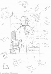  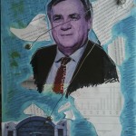 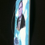 Liz & Dolores managed to arrange for an internal interview to be conducted with Mr Wright which coverd his life at the firm and what memories he would take with him into his retirement. As I mentioned the commission was a suprise gift and therefore the interview was conducted under the premise of an ‘exit article’. The interview provided me with a plethora of detail that allowed me to shape the concept sketches further. After consideration we then chose a preferred composition; I produced a final mock-up (see above) & sought final feedback as this is essential in creating very strong bespoked piece of art! The final composition was agreed on the 21st December 2011. The Final Composition: Everything in the final design was arranged based on the information I received, with each component working with its surrounding elements. For example;
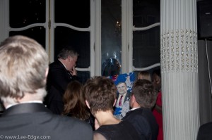
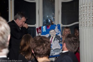
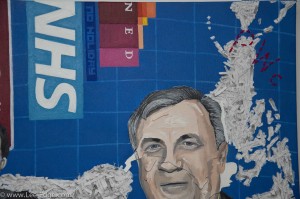  The final pieces of the jigsaw were provided by Philip’s wife Ziggy & Dolores in the form of numerous photographs of Philip and Pricewaterhouse black and white corporate head-shots of Anthony , Brian and Quentin. Dolores explained that Philip, Anthony and Brian were known as the ‘Three Amigos’ as the rampaged through the ranks of the firm and he mentioned them heart warmingly in his interview. Unfortunately, neither of them is still with us and they were both represented at the presentation dinner by their elegant wives. Quentin and Philip are also close friends who will be following in the footsteps of Philip’s son by embarking on the Digital Theatre initiative (as his son mentioned in his speech ... isn’t this usually the other way around!?). I started to prepare the canvas and obtain the required materials over the Christmas period. Although, I committed to the task fully from the 2nd January, which left me 16 days to complete the work. Throughout these few weeks I was able to provide my clients with images showing progress and a platform to discuss any composition additions (e.g. the ‘no holiday’ reference). Receiving the interview feedback so close to the Christmas period always meant that this was going to be a tight deadline to meet, especially, as I had to work around my new career at KPMG. This meant some late nights (including an all nighter on the 17th) and two very productive & long weekends. This was a fantastic experience!! Not being able to relax, as I felt I should be working on the commission, was a challenge but I loved every minute of it! I have always worked well under deadlines as it focuses my mind like nothing else! That said if the deadline was Christmas 2012 I would, due to my slight OCD nature probably be still working on it . The Presentation: Finishing a commission is always amazing, and this was no exception. The feeling of accomplishment and succeeding in ‘hopefully’ producing something that will be treasure is amazing. The euphoria carried me through the final touches – compliments slip explaining how much effort Liz, Dolores & Chris had put in and how I was grateful to be involved; personalised stationary; attaching the wire to the back of the frame for hanging etc (see below). I am very grateful to Liz & Dolores for inviting me to see the painting being presented by them at Philip’s retirement dinner at the Savile Club in Grosvenor Square. It was a great venue and a fantastic evening! It was full of Mr Wright’s close friends and colleagues who relished sharing in this special occasion. It was probably the best PwC networking event you could have ever wished for, but for me it came 6 months after leaving the firm :) Liz & Dolores presented the painting at the end of the meal and I was able to grab a few photos to capture the moment. Thanks again to everyone involved in helping shape the commission, thanks to Liz & Dolores for inviting me to the event and to Philip for thanking me in his closing speech. 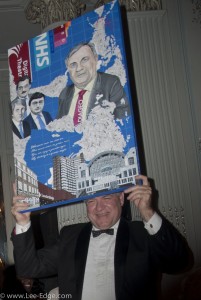 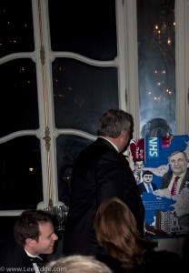 It was amazing to be part of and I hope the painting is treasured for the passion that went into it from people who Philip obviously had a great impact on during his time at PwC! Edge ... over and out....... PS – If anyone is interested in discussing potential commissions please contact through my site or at lee@lee-edge.com.    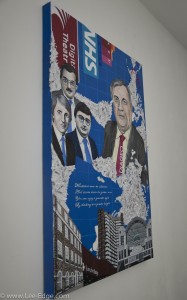 |


|
|
|
|
|
|